Want Row & Column Form Layouts? Just Drag & Drop!

Don’t have time to wrestle with code? Drag & drop fields for row & column form layouts in minutes!
Want your forms to look like they were built by a professional designer? Nothing screams “stock” quite like a long vertical stack of fields. Row and column form layouts look much better and are easier to read and engage with. And they really are easy to make!
Tried looking into CSS and HTML to make this happen? You already know you’re in for a long and winding rabbit hole of learning.
Even if you have experience in web design, themes don’t always make this easy. Sometimes their code even actively get in the way.
Hiring a designer is maybe an option, but why pay someone when you can do it yourself in just minutes?
How can you build fully responsive, mobile-ready row & column form layouts in just minutes? It’s so much easier than you think!
Build mobile-ready row & column form layouts with a drag & drop form editor
You’ll never need to touch CSS code to organize fields into clean rows and columns. Using the Layout & Styles add-on, just drag and drop them into place:
Just click on the field you want to move and drag it to the blue bar next to the field you want it positioned next to. Let go of your mouse button. That all’s there is to it.
This works just fine with 2+ columns, too:
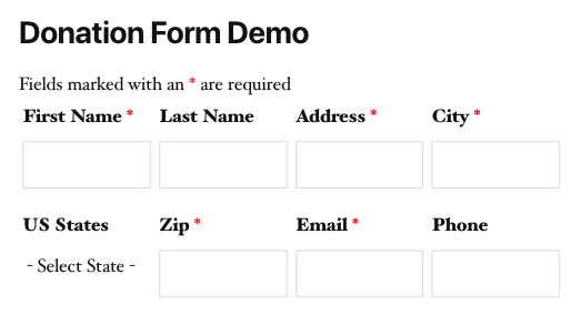
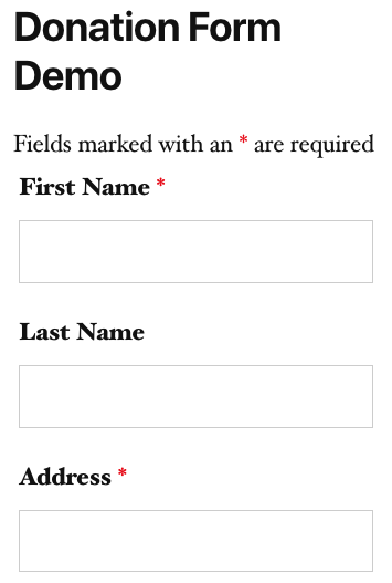
Your form will also scale and look great on smaller resolution devices with any well-made theme.
Page viewed on iPad Pro:
Page viewed on iPhone X:
Never spend more than a few minutes making professional quality WordPress forms again!
Even if you’re not a professional web designer, the technique above can make you look like one. You don’t need to learn code to make your forms look good. You don’t need to spend money on a pro to do it for you. Pick up Layout & Styles or any Ninja Forms membership now and start whipping up professional quality row and column form layouts in just minutes!
Bonus: looking for an easy way to make list field options into a neat horizontal row? Check this out!
Comments are below! What else would you like to see to help make your forms look better faster?


Thank god! 🙂 Very welcomed addition feature 🙂
So how does this work for people who bought (or are looking at buying) the Layout & Styles add-on? Does this replace the add-on or is the add-on more sophisticated?
Roland,
Great question! Layout and Styles goes far beyond the simple CSS class adjustments that I’ve demonstrated here. Take the steps above for example- with Layout and Styles, there is no need to use a CSS class at all for resizing or grouping into columns or rows. You literally just grab a field with your mouse, drag it to where you want it, and drop it. The builder will do the resizing for you, creating columns and rows with no need to declare ‘one-half’, ‘one-third’ etc. You can even make further resizing adjustments from there just by grabbing the edge of a column and dragging it with your mouse. Column and row layouts are not the extent of Layout and Styles’ capability either, it’s just one part of the total package for really taking your form and sculpting it to look exactly how you see it in your mind’s eye.
Check out this video to see part of it in action! The good stuff starts about 2 minutes in. There’s also a link directly under that video to a demo of THREE. You can play with a preview of Layout and Style’s functionality there.
Hope that covers your question. Have a great day!
Cheers,
Quay
Thanks for the answer. That’s definitely good news. We’re working on two new sites with at least one more on the way, so we’ll likely be getting some licenses for add-ons soon.
It seems to work fine on Chrome, but not on IE. In IE the fields still display on their own row. BTW, Ninja forms doesn’t have a field called wrapper, but it’s called container. That is where I’m adding the class, could that be the problem?
Victor,
Hey! I’m honestly not sure about IE- I’ll make myself a note to test on my pc at home, but it’s notoriously buggy.
For the wrapper, you’re not looking for an actual field that you add in the builder. Check out the 2nd screenshot of the article- the field settings window of an Email field. Look down at the bottom of that screenshot. See the Display options, and under that Custom Class Names? There’s a wrapper field there. That’s what the article refers to.
Cheers,
Quay
Thanks Quay for the fast reply! I wanted to send you a screenshot, but I can’t do it here. So I’ll reply to that email in case you can get it. My screenshot is different than the one on the page. Under Display>Custom Class Names I have a field called “Container” where the screenshot shows that field is called “Wrapper”.
Hi,
Is it also possible to only get 2 columns visible on a desktop and on the mobile 1 column.
Because if I look now on my phone, the fields are to small.
Flits,
Ninja Forms is fully responsive to device size and will scale alongside screen size, but your theme controls how Ninja Forms responds. i.e. if it’s not responding to screen size changes properly, it’s because your theme’s styling is not allowing it to.
Cheers,
Quay
Hi Quay,
I applied these steps to both, “Frist Name” and “Last Name” fields to have them in one row, but they are still in two rows. They both are half the size, but still in one column. The Last Name field is a little indented. Did anything change since the day you posted this article? Is the CSS different?
Rosy
Rosy,
Mileage will very on how much you are able to do with the wrapper classes dependent on how your theme applies styling. If it’s a bit over aggressive in the CSS rules it uses, then it can override your input here. Sorry.
Regards,
Quay
Great feature! Spent a while figuring out how to do it until I stumbled across this post.
Keep up the good work guys!
Noticing the same issue as Victor Smilgys in IE11.
The problem appears to be IE actually handling the wrapping elements and thus breaking the floats of the one-half elements nested within.
Fix requires some overriding IE only css :-\
Otherwise, amazing plugin. Keep up the outstanding efforts!
Thanks for the feedback, Will. I’ll mention this to our dev team and see what their thoughts on it are. Much appreciated!
Do you happen to have the CSS fix?
Hello Quay!
Great article! Learnt a few tricks on getting exactly what I’m looking for with Ninja Forms Three! I do have one question though. I have a list, with 3 options in it. In the old NF, by selecting Label on right, the list would align horizontally. Now no matter what I do, I cannot seem to get the list to align horizontally.
Now I know you mention it in the article, but I do not have 3 lists so that I can use one-third first (for example). It would be nice to just have an option (like the switches you guys are now using!) allowing you to chose the display of your list as horizontal or vertical 🙂
Oh and if you have any references on getting this done with the least amount of coding knowledge possible, that would be awesome!
Thanks again!
Paul
Paul,
Thanks! Unfortunately there’s not a setting to align a single list’s options horizontally. It’s super easy to make a horizontal row of list fields that lay out horizontally using Layout and Styles, but not the list options themselves. For that you’d need to write custom CSS, unfortunately. That’s a really interesting idea though, and I’ll be sure to mention it to our dev team to consider!
Cheers,
Quay
I had the same problem as Rosy and others: the second “one-half” just indented slightly instead of sharing the same line as “first,” due no doubt to the page theme as others noted.
As an experiment I tried setting the two wrappers to “one-third first” and “one-third second.” Eureka! Both fields are on one line. I suspect that Ninja Forms is taking one-half of the page width while the theme sets the margins in from that point. Maybe the developers could check that?
In any case, my workaround may help someone out there.
Did any documentation ever get made for this feature? It’s very useful, but I can’t find any information beyond this article.
Blake,
Hey! For working with the wrapper class names, this is all we have. For Layout and Styles, we have quite a bit.
Directly relevant to this: https://b02c0f4e-a0f9-475a-b182-151a505453f7.cv02.conves.io/docs/layouts-and-styles/
For all of our styling and other documentation, you can find that here: https://b02c0f4e-a0f9-475a-b182-151a505453f7.cv02.conves.io/documentation/
Cheers,
Quay
Hi, I no longer see Class Names under Display in your field settings, did you remove the ability to do this?
Hey! Enable dev mode: https://b02c0f4e-a0f9-475a-b182-151a505453f7.cv02.conves.io/docs/developer-mode/
They’re still there, just hiding on new installs 🙂
Does this feature work for things like checklists and radio button lists?
Tia, check this out 🙂
https://b02c0f4e-a0f9-475a-b182-151a505453f7.cv02.conves.io/blog/column-styling-for-list-fields/
How do you activate this? I am not not seeing any of what is shown above. Do I have to buy something in order to get this drag/drop column feature?
You’ll need the Layout & Styles add-on, or any one of our membership plans (all include it).
Hi Quay
Thank you for the video!
How do I make the row with two elements to show on mobile? because the fields seeing stack on top of one another (on mobile)
On desktop all is great can you show us the CSS code with wordpress?
https://novenaprayer.com/novena-membership/
Thank you
Nicola,
Glad you found it helpful!
For side by side fields on mobile, that gets tricky. Your theme is just doing its job by checking the resolution size when the form loads, seeing that it’s a small screen, and breaking the fields down vertically. That’s going to override the directions from Layout & Styles telling the fields to present side by side. That’s by design because if Layout & Styles didn’t defer to your theme’s instructions in this case, you’d wind up with the form being wider than the other content on the page (forcing the reader to constantly left-right scroll while engaging with the page, which isn’t fun) or with the form fields being shrunk down to fit side by side to the point where they’re hard to use.
I don’t know that there’s a great solution for keeping fields side by side and still usable for folks on mobile. I’m sorry :/
Cheers,
Quay
Hey there, I’m using the Layout & Styles add-on (paid), and I was hoping to add a border or background around a specific row – see: https://snipboard.io/TmowFP.jpg. Is there any way to add a class to a row? Or otherwise style a row that has multiple elements in it? Thanks!
I should clarify – I don’t want borders on every row. I want to be able to create field groups that can optionally have borders or other styles.
Hi,
How do you make this work for a field with a repeatable fieldset?
Hello David,
If you add the Helper Classes found in Styling Your Forms to the Custom Class Name fields of each individual form field, you should be able to align the repeatable fields side-by-side. I’m currently working on a blog post for this was will be released sometime next week.
Can the free version of NinjaForms do this or just the paid version?
👋 Doug,
To access the drag-and-drop functionality, you will need the Layout and Styles add-on. Otherwise, you can apply layout classes, found here to create multi-column layouts. I hope that helps. Feel free to reach out to our support team if you have additional questions: https://b02c0f4e-a0f9-475a-b182-151a505453f7.cv02.conves.io/contact/